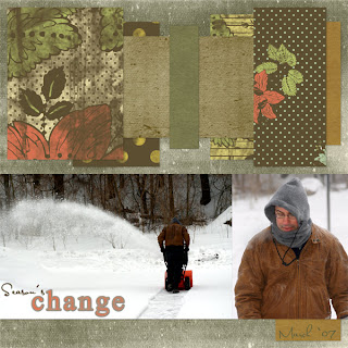
Season's change
This is a pretty straight forward LO. I used all the drop shadows included with the Quick Click except for the middle box on the top where I used my own. I stayed with the same designer when I needed more papers for the layering on top and tried to find ones that would match the photos and the kit. Tried to match the font from the title for the date and pulled the color for that out of the green background paper and then darkened it a bit. Other than that I used levels to correct the larger photo as the snow looked like a different color in it from the other photo.
I've been wanting to take snow blowing photos for many years, but usually the storms are at night or the wind is whipping around or it's in the middle of a storm. Everything lined up this time so that I could get some decent photos.
Sunday, March 18, 2007
Saturday, March 17, 2007
Unique as a snowflake
First I duplicated the ivory circle border and rotated it 90 degrees and then I lowered the opacity on both of them about 10 percent. I added the overlay, cut the mat out of the brown background paper. I threaded the snowflake element into the ribbon using the same technique as the last entry here. And then I used Wow Organics 10 for the lace at the top and Wow Organics 20 for the word art. I lowered the distance on the drop shadows for both of them.
This photo was taken just as the NorEaster was starting. We ended up getting well over a foot of snow by the next day!
Lucky Hat
Lucky Hat
First I cut a space out of the flower background paper (made two different layers) and put the dark black background paper under those. Lowered the opacity on the gold scroll element and then duplicated and rotated 90 degrees three times and moved them until I had gold scroll all the way around the frame of the inner flower background paper. On the holes with ribbon element I magic wanded the inner hole with contiguous checked; then expanded the selection by 10 pixels and then hit the delete key after I changed to the photograph layer. Did that on both holes. Then I interacted the wire and hanging wire elements by duplicating both; putting the item they interact with in between and the removing the underneath part on the top layer and adding drop shadow to the lower layer. And finally, I used the DSP carved text style on the date in the photo.
We were just fooling around taking photos with the hat that my son was given in school the day before.
Sunday, March 11, 2007
Catnap
Catnap
First thing I did was to put the leafy flower background paper on a layer under the background paper and then lowered the opacity by about 10 percent on the top scrolly paper... it just seemed to overwhelm the other papers until I did that. I also selected each of my strips and then expanded them by 10 pixels and cut the new selection into the black paper to outline them and give them a little pop. The flower element I duplicated and then placed the end flower over the end flower of the first layer... this gave the entire flower line a better feel of continuity. For the title I used Atomic Cupcake's Chipboard effect. Pulled the color for it out of the leafy flower background paper...
This kitty enjoys sleeping upside down like this every once in a while. She was so into it that I took at least 10 photos without her waking up...
Do what you can
Do what you can
First I selected one of the four same-sized squares and then I moved or transformed it into a larger size. Then I made a new square inside the large frame and nudged it around and deleted the frame until the width of the big frame itself was the same size as the smaller frames. (I also had to re-align it with the other frames.) After that I selected all the frames and cut a new layer out of them in the darker purple paper. I put that purple layer on top of the white frames and kept the white layer because it had the slightly bended shadowing on it. Everything else is just straight forward element placing and sizing...
I walked in on the kitty sitting in the afternoon spot of sun cleaning herself. She continued what she was doing as I took photos. I thought that her coloring went well with the purple tones in this beautiful kit!
Wednesday, March 7, 2007
Keeping me company
Keeping me company
First I duplicated the half circle, rotated it by flipping it horizontally, and then moved it so that it made a circle with the first layer. Then I merged those two layers and duplicated the circle. Pulled the second circle a little bigger and then cut a circle out of the green paper after I rotated the paper by 90 degrees (to make the grain different from the beige background paper). For the flowers, I used the element over the sketch on the paper, but that left some open space on the background paper, so I duplicated the flower element and made the second layer smaller and fit it in the corner until I liked how it looked. Just added drop shadows to all the elements after that, except for the font that I gave a tiny bevel to.
For about a month last year I searched for some lost negatives... In this photo I had a hope chest open and was going through everything there... I keep alot of my old photography stuff there so I was quite hopeful. The cats decided to spend some time sleeping while I worked and when I took a break I got this photo.
Thursday, March 1, 2007
Who am I?
Who am I?
First off, I blended the dark brown background paper with the flower paper. I lowered the opacity on the flower paper. Then I used the gold swirl overlay and lowered the opacity on that as well as the gold edge overlay. I decided to darken the lower background swirls and the outline circle by using the enhance; hue/saturation function and lowering the lightness. Then I cut another circle out of the brown background paper and put it on top of the circle/swirl element. I did this because the quick click called for a photo there and I wanted to use word art - and with just the word art the LO seemed to be missing something. And the quick click didn't have the photo squares for the three bottom squares. So I used the jpg that came with the kit as a sample - made it a layer the same size as the LO and then drew selections around the photos. Cut those shapes out of a background paper and then used those shapes as a guide to place the photos straight in my LO. The style I used on the word art is Wow Gems 15 - it looks blue in the sample, but this is how it turned out.
These photos were taken at Christmas this past year...
Subscribe to:
Posts (Atom)