Wednesday, May 23, 2007

Take time...

Take time...

Selected the flower layer on the QC and then made another layer and filled it with the color that I liked. Then took another one of the background papers and used it as a texture for this layer. Then I used the dark green color of the butterfly to stroke the edge. Did the same thing with the butterfly using the lighter green color of the flower layer to stroke that edge and did not add texture. Enlarged the background layer a tad bit to get rid of the erased white part. And I used two different sections of one photo for the two photos. For the journaling under the title I also used the dark and light green to stroke the font.

Quebec '07

Quebec '07


Pretty straight forward layout here. I did lower the opacity on the border layer and the upper left corner overlay. Then I cut the title out of the beige paper and beveled it. The date I used DSP carved text style on.

Tuesday, May 22, 2007

Kitten Becca

Kitten Becca

The only trick that I did with this one was to blended the two purple papers from the two kits together by lowering the opacity on the top purple one. Also played with the opacity of the two carved items so that they matched each other in intensity.

Saturday, May 19, 2007

Nana and Mason

Nana and Mason

Started off with a white background. Put the lightest background paper in the kit on it and lowered the opacity of that layer. Put the ribbons where I wanted them and then cut strips out of the lined paper for behind them. Cut the two circles and then the photo mat. Removed the strip of paper behind the ribbon ring by selecting and then deleting. And then added the two journaling boxes.

This photo was taken 12 years ago... seems like it was just yesterday. Nana came to visit and she combed Mason's unruly hair... so I took a photo with everyone looking all spruced up!!

Purrfect!

Purrfect!

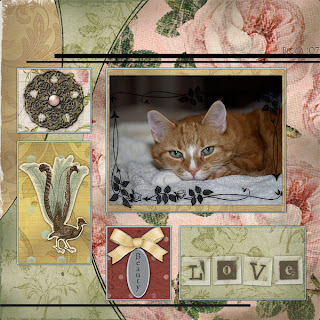
Lowered the opacity on the flower borders that go around the edge of the layout. Used atomic cupcake's chalking action on the photos and the journaling tag and brackets. Used the action and then Control clicked the thumbnail of the layer in the palette and then cut and pasted the chalked layer over the original and lowered the opacity on the chalked version until I liked the effect. Locked the transparency of the word art and then brushed the brown color onto it.

Becca is so old now that she really doesn't care if I take photos as she goes about living her life. So when I got the camera out one afternoon while she groomed she didn't miss a beat and I got these photos.

Lilacs

Lilacs

This was a very easy layout to make. Used a template that I had for quite a while. I did use Wow chrome style on the word art and lowered the distance and opacity a bit of the drop shadows. Removed part of the hat pin to make it appear to go through the paper. And I used DSP carved text on the date in the corner of the photo and lowered the opacity on that layer as well...

This year it has rained nearly every day that the lilac bush has been in bloom. I was able to take a few photos as the flowers were opening up about a week ago...

Tuesday, May 15, 2007

Cherry blossoms

Cherry blossoms

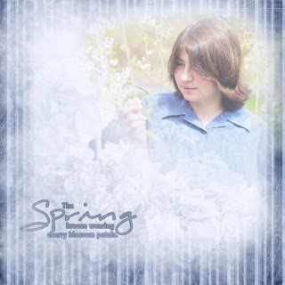
The background paper is the light one with the faint flowers in the lower left corner. Put the photo in the upper left and drew a selection around a triangle section of it with feather at 150... reversed selection and deleted. Then took the striped paper on top and drew a selection in the center of that with the same feather and deleted that. Still had to erase any hard lines at the photo's edge with opacity at around 20 percent. Then reduced the opacity of the photo to around 20 percent and duplicated that three times and put those three layers on soft light at an opacity of around 50 percent. You'll have to play with that to get the effect that works with your photo. Then used the hydrangea strip at the bottom and the circle lace element behind the word art and reduced the opacity to where you can barely see them. Locked the transparency on the word art and colored it blue and then added a stroke of darker blue to it. Lowered the opacity of that as well and moved it below the striped background paper.

Monday, May 14, 2007

Spring

Spring

Cut the ribbons out of the background papers and then used the ribbon in the kit on top of them. Other than that I just lowered opacity and distance on the drop shadows and used Wow Chrome 5 for the word art - adjusted the properties a tad bit too!

Sunday, May 13, 2007

Nap interrupted...

Nap interrupted...

The quick click that I used was an 8x10 but I hoped that I'd be able to use it within a 12x12. Ended up working alright, but I felt compelled to put something in the top and bottom space and try as I might - I just couldn't work any pure white into the LO... so it's different than I envisioned in my head when I started. I lowered the opacity on the bottom background paper with a layer of white behind it. Added a rectangle of the darker red paper behind all of the photos as well. And I recolored the word art and accent swirls above and below the photos and then gave them a little bevel - also lowered the opacity on the swirls just a touch. The word art I used Wow Metal 07 style and played around with the drop shadow settings a bit.

Saturday, May 12, 2007

Languishing loudly...

Languishing loudly...

This is one of those new plopper pluses; where they sell you a layout and you pretty much just plop your photo in, but you have control over the layers. So I did things like adding drop shadows and playing with the settings until I was happy! Also added some word art instead of an additional photo! This was fun to play with - will definitely be checking this type of product out more!! Oh yes, used one of the Wow Chrome styles on the word art and played with the drop shadows here too!

Boys Rule!

Boys Rule!

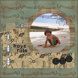
Very straight forward LO! Only things I did here was to erase the photo corner from the spider; lower the opacity on the word art and I have two layers on the font - top layer is DSP carved text with the opacity lowered on it as well until it sort of looked like writing in the sand!!

This is one of the photos that I have hanging around gathering dust on my puter. I did a little restorative work on it, by using the healing brush to get rid of dust marks and the like! Had to adjust the shadows on it as well to bring out some of the detail in the shade!!

Friday, May 11, 2007

Act Natural

Act Natural

This was a very straight forward LO where the only things that I did extra were to make the black swiggly lines into a selection and then to cut that out of one of the background papers. Then I put that layer under the black lines. I also lowered the opacity of the swirl element.

Bright Vegas Lights

Bright Vegas Lights

I found that since things were so big in size and so far way on the Vegas strip that it was really hard to get a photo of a person and the object and have both of them in focus. So I would take two photos - one of the person in focus and another of the landmark in focus. Then I just photoshoped them together. Other things that I did in this LO are to change the circle grunge frame into a Wow metal style, made the photo a little larger and used the same font to match the word art for my journaling. Also lowered the opacity on the gold corner elements.

Figaro

Figaro

Used PhotoBlast Chocolate action on the photo. Then I lowered the opacity on the girl, the blue butterfly and Chinese character elements. I cut the flowers out of one of the background papers and used the circle element as a center button for them.

I just love this photo of Figaro - once I ran the action on it to sort of antique it he looked so serious and formal.

Joy blooms...

Joy blooms...

Only different things I did here was to put a slim mat frame on the photos and then I added a ribbon and the brads to the LO. I also sort of threaded the word art through the photos and added Wow metal style to it with no drop shadows. Used DSP carved text style on the date.

These photos were taken last year. I'm still waiting for them to bloom in my yard this year - mostly so that I can prune the bush - it's over a story high at the moment and is trying to take over the landscaping!!

Turning three...

Turning three...

Took three of the backgrounds and reduced them down to small squares and used them as elements. For the stars, used one from the kit and then made one from a background paper - the other three I pulled the color from the background papers using the color picker. Pulled the colors with the color picker for the square frames too!

This is one of my favorite photos! It was taken by a dear friend and had to be somewhat restored - lots of dust particles. This was the first year that we were able to get my DS to eat cake. He was an incredibly picky eater the first few years of his life...

My dreamy little one...

My dreamy little one...

First I reduced the size of one of the papers and used it for one of the squares. Went looking for more papers and found another one by the same designer that matched fairly well. Used Wow Chrome style for the two word arts. And I reduced the opacity a little on the ribbon drop shadow.

This kitty has always slept like this, but when ever I would try to take a photo of her she would wake up. Now that she's getting much older she doesn't hear me as well or she doesn't care as much and I was finally able to get a photo of her doing it.

Trip to Mt. Sakurajima

Trip to Mt. Sakurajima

The special things that I did to this LO was to chalk in a light blue the large round photo with Atomic Cupcake's Chalking action. I also chalked around the two journaling mats with a gold-brown color. And I lowered the opacity on the fan.

My DH went to Japan and was taken on a day trip over to Mt. sakurajima. He was able to see the mountain from his hotel as well. He had a fabulous time and I got to have these wonderful photos!!

Monday, May 7, 2007

Simple Nature

Simple Nature

First I cloned the green paper over the botanical description of the flower on the background paper. Then I horizontally flipped the paper. Then I cut the two squares out of the photograph and cut another rectangle shape just a little larger than the two square together. Put that layer underneath and lowered the opacity on it so that there was just a hint of it for continuity. Added a long rectangle strip under the three upper squares as well and then added the word art and used Wow metal style. Also added the vine overlay to the upper left corner and lowered the opacity a little on that as well.

This photo was taken of one of one of the crocuses that my DS helped me plant a couple of years ago.

Shin Buddhist Temple

Shin Buddhist Temple

Selected the inner part of the background paper with the "frame" and then deleted it. Selected it again and modified it by contracting until it was inside the frame with a feather around 75 then inverted the selection and Gaussian blurred it at a radius of 250 pixels. In between those two layers I put the photo and then the ribbon on top of the layers. Used Wow metal style on the word art and DSP carved text style on the temple name.

DH said that volunteers pulled up in buses and worked in the gardens. Then they all went to this court yard and broomed the ground for a little while. When they were done they returned to work in the gardens.

Imperial Gardens

Imperial Gardens

This one is incredibly straight forward. Just used the template to cut the shapes out of the papers and then used a Kanji character and a dragon on the photo corners.

My DH got to go to Japan for a business trip and my souvenir gift was a smattering of photos. Well, the photos were one of my gifts... lol...

Sunday, May 6, 2007

Somebunny loves you...

Somebunny loves you...

Where to start on this one? Took the brown background paper with the bunnies on it and made it smaller. Cut the yellow paper to frame it and the photo. Then I cropped the photo into a square. Took the bunny vine frame, removed the bunnies and then colored it to be almost what the brown paper color was. Colored the word art and added a slight bevel to it. For the title I used DSP carved text style.

This was the last time that the two of them slept together - two days before he passed on. He had been pushing her away, but as often happens, had a day where he rallied and allowed her near him. She still looks for him in his favorite spots and misses him terribly!

THE Hotel

THE Hotel

This one again uses a template. Picked a photo where most of the interest was through the middle for the main photo. Used the word art to cut the title out of another background paper and then beveled it. Also used Wow metal style for the journaling.

The elephants aren't real but they sure look realistic. This statue was along the driveway of the main entrance to the hotel. THE Hotel was part of the Mandalay Bay property. And was located at the very end of the strip.

Without Envy

Without Envy

This was a template as well - been using alot of them lately - and the only special thing that I did on this one was to use Atomic Cupcakes Chalking Action. I chalked the lighter layers with a tannish brown and the red with a little darker red. Just seemed to give everything a finished touch. Also used Wow Metal Styles on the word art and the title.

These flowers were taken last July in my summer garden. There were so many of this color that I really just wanted to take a photo of the group rather than one up close.

Mason's Photos


Mason's Photos

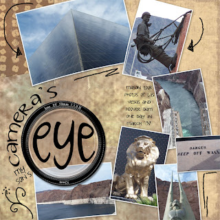
This LO is very straight forward. Used a template and the only change that I made was to add the word "son's" to the title.

It was fun to scrap someone else's photos. And to see the same things that I had photographed through another person's eye!

Shabby Becca


Shabby Becca

The only trick to this one was using the mat and photo layers of the template for papers and then adding the elements to it. And then I used the vine element to frame the photo inside the edges. Other than that I just adjusted the drop shadows alot to make the elements look alright.

Dealing in Pastels

Dealing in Pastels...

I rounded the corners on the mat and the photo by making a rounded rectangle shape with a radius of around 50. Then I cut both the paper and the photo with that shape. For the word art I selected the bottom half and then moved the selection down until it worked with my photo and LO. Then I used Wow gold as a style on the word art and lowered the opacity a little on the ribbons, butterfly and the flower. I believe that I also added one of the swirls to the bottom and lowered the opacity on that as well.

Saturday, May 5, 2007

Touching toes...

Touching toes...

First thing I did was to select the child in the tag and then Control + J to make a new layer of it with the orange. Then I spent a great deal of time cutting the sun element out of the orange as well and put it behind the bookmark. After that I realized I could have just put an orange square back there and would have gotten the same effect! Used the DSP carved text on the top of two font layers and then had the lower font layer in the same orange color...

At Hoover Dam they have these amazing large statues and they tell you that if you touch the toes it will bring you good luck... You can see that the metal is getting worn down a bit from everyone rubbing the toes. In this photo Mason was making a run for touching the toes and had just turned to look at his father...

Vegas baby!

Vegas baby!

Took this Quick Click and flipped it for a horizontal photo. Didn't use the journaling strips; instead added the word art. Used a Wow Chrome style for both the word art and the journaling around the corner. Played around with the drop shadows on both as well.

My son was running down the stairs as we were taking the escalator. He was trying to beat us down. This is the beach area of Mandalay Bay where you go to pick up your car.

May Dogwood

May Dogwood

Made this by cutting strips of paper out of the backgrounds... The word art style was a Wow style - one that has a stroke around the edge. Fooled around with the drop shadows on the word art as well.

I'm really getting anxious for the weather to turn warm and for my garden to start blooming. These photos are from last year.

Spring Snowdrops

Spring Snowdrops

This was also straight forward, but I had to move the two strips of paper at the bottom up a bit so that the title would fit properly. I used the S from the kit and then added the text; using Atomic Cupcake's Chalking Action.

Finally some sunny warm days and I went out and sat down next to these little flowers and got some shots of them. I love these little flowers because once I see them I know for certain that Spring warmth can only be a few weeks away!

Taking photos

Taking photos

The only trick on this one was taking the Quick Click and moving the parts of it around. I had a horizontal photo and needed to change the orientation of the template. Other than that really nothing other than straight forward digital scrapping.

These photos are of my son on the Hoover Dam taking photos of a plaque that was there as a dedication to those men that had risked their lives to build this wondrous structure. In the main photo he is standing in front of one of the windows in the middle of the dam and you can see the newly build visitor's center in the distance behind him.

Bellagio - Las Vegas

Bellagio - Las Vegas

Pretty straight forward LO here! The only trick on this one was to use two layers of the opaque butterflies and then to reduce the opacity on the top layer to around 50 percent. Also lowered the opacity on the flower itself.

These flowers were inside the Bellagio Hotel in Las Vegas!! There was an entire garden with every bloom at the peek of perfection. We went to the Bellagio to see the water fountain show out front but it was too windy for them to have it that night.

Sleep and let sleep

Sleep and let sleep

Tried a new extracting technique on this one. The dark cat was against a light pink background and in order to keep the fur I first drew around the cat with a feather of about 50 and then deleted the background. Then I used the burn tool to darken the pink and erased what I could using about a 30 percent opacity. I also cut the word art out of another layer of the flowers and then beveled it. Other than that just played around with the opacity of the layers for the swirls and the overlay.

I've fallen very far behind but I'm going to try to catch up here. Sometimes life just gets in the way of good intentions!