Sunday, August 17, 2008
Mason '98
Mason '98
I cut the brown cardboard background paper using the tear frame as a guide. Then I cut the strips for under the photo just by using the Rectangular Marquee tool. Other than that it was a matter of arranging the elements.
Mason and Julie
Mason and Julie
It's been a long time since I put this LO together but I know that I used one of the photoblast effects that lowered the saturation on the two photos. Then I put a copy of the original photo underneath and lowered the opacity on the filtered one until I got the amount of color that worked with the kit. I also lowered the opacity of the pink background paper on top of the QC white frames until I got a less patterned look. Other than that I lowered the opacity on the tabs and changed around the QC a bit in order to use the elements in the kit.
Friday, July 4, 2008
Dare to dream
Dare to dream
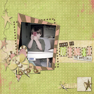
First thing I did was to filter the photo - I believe that I used Photoblast Color Wash Pro. But the idea was to tone down the bright colors in the photo to match the more muted colors in the LO. Then I cut the strip out of one of the background papers. Feed the star strip through the heart cutout by making two copies of the star element and putting the heart cutout inbetween. Then I erased the part I wanted on the top star element and added drop shadow to the bottom one.
Looking cool....
Looking cool...
This was such a fun template to play with. I cut the swirls out of one of the background papers. And the other things I did on this one was to lower the opacity on the "wish" button and put a dark blue stroke on the font to make the yellow pop a little better.
Thursday, July 3, 2008
In front of the Spamalot sign
To make this LO I did a fair amount of lowering the opacity or blending. First of all the star background paper had its opacity lowered and then I cut a piece of the darker background and lowered the opacity of the photo on top of it. I also lowered the opacity on the brown paper in the blue circle. I used the create warped text font tool to make the journaling inside the circle. Other than that I just arranged the elements after making the squares to frame everything on.
Playing Monopoly
Playing Monopoly
Okay... this one was pretty much putting the elements into place. I wanted to do a LO with the large flowers and the photo smaller. I'd seen some like it in galleries. I also lowered the opacity on the shadow flowers in the background and the leaves and the smaller ladybug in order to make the yellow and white flowers stand out more.
Monday, June 9, 2008
Summer '95
Summer '95
This one is very straight forward. The only thing that I did other than arrange elements was to make the glitter frame a little larger so that the really heavy edge isn't seen on the page... then I also lowered the opacity of it just a smudge. I also picked the color for my journaling text from the green glitter too, making it just a touch darker.
So fun...
So fun...
Yikes! I hate falling behind! I decided to try to catch up on the challenges and now I'm behind on blogging and everything else!! Anyway.... I'll try to catch up over the next couple of days here! First off, I used two copies of the photo with the heart in between. Extracted the top of my son's head in front of the heart. There were some spots of the blue high chair still in his hair so I used the clone tool to make them the same color as his hair. Then I put a copy of the bling swirls on either side of the ribbon that I cut out of the pink paper and erased the ones on top that I wanted to look behind. Other than that I lowered the opacity on the little journaling tag.
Tuesday, May 27, 2008
Christmas '95
Christmas '95
First I used Photoblast Sun Kissed Pro effect on the photo and I applied the paint by light feature twice on Mason. I then rotated the swirly element, lowered the opacity on it and added the flowers. Then I cut the background papers, using the templates and added the star overlay just under the side circles. I added drop shadows to everything except the swirly element and the butterfly.
Under the Vegas Sign...
This LO was very straight forward. Mostly finding the elements to go together, tried to stay with the same designer for most of them. I did cut the circle out of the blue paper and then enlarged it slightly and lowered the opacity of it behind the circle frame. And I used a slight stroke on the journaling so that it was easier to read.
Wednesday, May 21, 2008
Katie and Margo '84
Katie and Margo '84
I used a quick click I picked up on the internet so this was just a matter of picking which papers to use for each part of the LO. Stayed with the same designer when I went looking for additional papers. I also had to fix the photo because it was an old scanned one. Used the healing brush tool to remove the few dust particles. And I made the button to go into the center of the flower so that it was a little more different than the other flower that I used.
Killer Rabbit
Killer Rabbit
First I used the Quick Selection tool to extract my son and the rabbit - I'm really getting to like that new feature of PSE6! Then I doubled the photo layer and put the frame in between them and erased what I needed to on the top layer. Then I doubled the vine/heart swirly element and put the top layer of the photo between it and erased what I needed to around the rabbits ear on the top layer swirly layer. Other than that I lowered the opacity on the elements in order to make the flowers noticeable. They were getting lost with everything that was going on in the LO.
Sunday, May 18, 2008
Blackie
Blackie
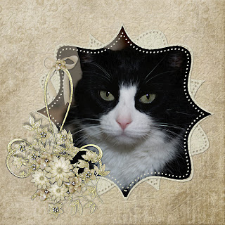
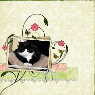
I began by selecting the bracket photo mat and then I cut the photo out of the selection. For some reason the result was rather transparent so I ended up making three of them to make the photo look normal. Then I made another copy of the bracket mat and rotated it a bit. Then I made the one behind the photo just a little larger. I put one of the backgrounds over the embossed one and erased around and behind the photo. The transition between the embossing and the regular paper was a little too abrupt so I made another copy of the erased layer and lowered the opacity until I liked the effect. Other than that I flipped the vine element horizontally and put them together and arranged the elements into the cluster.
Friday, May 16, 2008
My Garden
My Garden
First thing I did was to make two copies of my photo and then put one under and one over the frame. Then I used the Quick Selection Tool to select the flowers on the top photo layer. Took some work using the plus and minus to get what I wanted and I worked my way around the photo - deleting sections as I went. Then I cut the bottom photo to fit under the frame. I usually link those three layers once I finish the extraction just to be safe. The background papers I blended the plain one on top of the diamond one because the diamonds by themselves were just too busy looking to me and competed with the flowers. Other than that I just sized and arranged the elements.
Monday, May 12, 2008
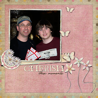
Cherish these moments
First I made the border by selecting the square and then hitting the delete key on the brown paper layer. After that I made two copies of the flowers and placed on of them under the frame and one on top. Because of the heavy shadow on the element I ended up erasing all of the top layer except where it went over the frame on the edge. Other than that I lowered the opacity on the circle under the flowers and arranged the elements slightly tilting things so that they weren't so lined up...
Sunday, May 11, 2008
Angel Max
Angel Max
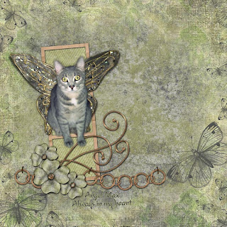
First I extracted Max from his photo. PSE6 has a nice feature where you can refine the edge after using the new selection tool. Takes a lot less time than all that old fashioned erasing of pixels. Then I put the two overlays on top of the background paper. I locked the transparency on the butterfly overlay and then selected a brush and fished around in the background paper until I found a color that was good for the butterflies. Then I brushed them the blue color. After that I cut the green background paper for behind the frame strip and lowered the opacity on that. Then put the wings behind Max and used the perspective transform tool and tried to get the wings to look good. I erased the butterfly antennas. After that I journaled and added a stroke of color on the text to make it easier to read.
Blackie in a box...
Blackie in a box...
First I cut the strips out of the background paper. I lowered the opacity on the orange ones to tone down the color a little. Then I duplicated the inner shadow for the box several times until I liked how the photo looked under them. And I also lowered the opacity on the bow to give it more of a lighter feel. Other than that I just arranged elements and added drop shadows.
Thursday, May 8, 2008
Hanging Out...
Hanging Out...
First I cut the mats for the circle out of the background papers and cut the photo to go inside the circle. Generally I will use the magic wand to select the space inside the frame and then expand the selection until I like how the photo will look. Then I made a second copy of the photo and used Photoblast Chocolate on the top layer. After that I erased at about 15% opacity the top layer until I liked the way that the kitty looked against the sepia background. Other than that I just arranged elements and lowered the opacity a little on the lacy metal outer frame.
Saturday, May 3, 2008
Precious
Precious
First thing I did here was to cut the strip of paper out of the pink. Then I used Photoblast's Rustic Charm to tone down the colors in the photo to match the muted feel of the kit. After that I just layered and erased the bling that was over things I wanted it to appear under - like the hearts on the scalloped mat and the ribbon. I also lowered the opacity on the star border.
Wednesday, April 30, 2008
Fabulous freebie site...
I found a wonderful freebie site -
it's Kubivet
When you find a kit that you like you click to download, then put the number you see into the box and enter and then wait for the clock to count down and your download will start. It's amazing how fast you can figure out a foreign language when there's a free kit that you want. And be sure to check out the fairies and the cat kit!!
Figgy 08
Figgy 08
The Bella Rouge kit was a very dark red one and I thought about using a white background with the dark red strips of paper, but then I went looking through Kerr's kits for something else that might match and came up with this one and I really like the way the diamond background paper worked. I cut the strips of paper - using an odd number. Then I cut a mat out of another one of the papers and used it behind the photo. Then I just added the elements and lastly pulled the diamond background paper down and to the left! And this was the first time that I scrapped a photo that I took as RAW format.
Saturday, April 26, 2008
Added Tools link
I have added links to the tools that I refer to when I make the LOs on the left hand side of the blog. The Wow styles (drop shadows and others) are in the edition of the book that I linked to on Amazon. The other sites all have fun tools to play with if you're interested in browsing...
Cat with no name...
Cat with no name...
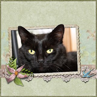
Got to use the new magic selection tool in PSE 6 on this one. Surprisingly it works really well and I only had to round off a couple of jaggies when I was finished. Other than that I didn't put any drop shadow on the strips of paper behind the photo because I sort of wanted them to blend in and I even lowered the opacity on the flowered paper to get the look. I did add Wow drop shadows to the frame, lace, flower and bird however. I did use the healing tool to get rid of some of the lint that showed up in the cat's black fur!
Thursday, April 24, 2008
Nifty new toy...
I recently found a fun action/effect that makes your LO ready for uploading to the web. It's Paint the Moon's Resize/Perfect for Web action for PS or PSE and can be found at Oscraps. I found for PSE that I only use a sharpeness of 20 and no extra saturation, but it saves me many clicks everytime I need to get something ready for the web!
Blackie
Blackie
I was off looking for a seamless tile filter (for free, of course) and I went to download the Redfield filter again because I wanted to make sure that it was compatible with Vista and what do I stumble across? This ultra cool Fractalius filter. And once I saw what people were doing with it I just had to have it! lol... One cool feature it has is a "dice" button that magically gives random settings that work better than my fooling around with it as this was one of the images it produced. As far as the LO goes I used the green background paper on the bottom and lowered the opacity a bit to let the sunflower paper show through. And I doubled the little sunflower by putting one on top of the other.
Tuesday, April 22, 2008
Beautiful Garden
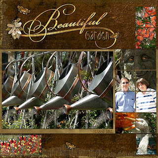
Beautiful Garden
This was fun and easy to put together. Picked the QC and the photos. The rich brown colors in the kit seemed to work with natural types of photos. In order to cut the photos into the squares I used the magic wand with contiguous checked and then selected the "add selections" button and clicked on the additional squares in the template that I wanted to include in the photo. Then I Control J to pull the photo into the squares and moved the photo squares to the top of the template. I also used Wow Metal styles for the garden and Belligio Hotel journaling and looked for one that sort of matched the Beautiful word art.
SPAMalot crown
SPAMalot crown
The photo on this one had a bright red background and some other distracting colors. So I duplicated the photo and used Photoblast Rustic Charm Effect on it. Then I put the Rustic Charm layer on top and used a large fuzzy brush with the opacity set to 15% and erased the face, crown and clothing area until I liked it. I ended up erasing the face and clothing area entirely and the crown about 50%. Other than that I added the elements and lowered the opacity on the journaling a bit.
Paris Casino
Paris Casino
First thing I did was to blend the circle background paper with the green one. Then I cut the circles out of the brown mat for inside the circle frame. Then I selected the circle frame itself and cut another one out of the green background paper, put it underneath the frame and lowered the opacity of the white to tone it down a little. After that I clustered the elements and rotated the frame a little and journaled.
Monday, April 21, 2008
Beautiful Becca
Just a quick note to mention that Marcee Duggar and Irene Alexeeva are giving away some free kits on their blogs. To get there just replace their names with my msmscraps in the url...
Beautiful Becca
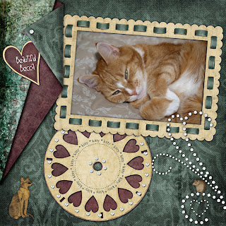
Started this by turning the corners of the background papers. Used an action made by Claudia Campbell that works in PS as well as PSE. After I made that I tucked the heart into the fold and selected one of the rhinestones from the bling and used it to hold the corner down. Then I selected the viewmaster reel by Control right clicking on the image in the layers and Control J on the burgundy paper so that you can see it behind the hearts. Then I selected the inner circle and Control J to get the green back in the middle. Other than that, it was just a matter of selecting the other elements and arranging them and, of course, adding drop shadows as necessary.
Blue Man Mason
Blue Man Mason
I just loved this photo and wanted to make it the main focus of the LO so I made it large and worked around it. Nothing really special done here except tinkering with the drop shadow distance and opacity.
Summer '97
Summer '97
Had to remove the noise from this really old photo - I use Imagenomic's Noiseware Professional. Then I made duplicate copies of the flowers and reduced some of them and erased the ones that went too far onto my photo. Made two sets of the butterflies as well and used the flip layer horizontally feature and then reduced the size of the top layer. To journal on the tabs I turned the entire LO 90 degrees to the left and then turned it back when I was done.
Blackie's garden
Blackie's garden
This one was such fun to make! Very simply I cut the paper by using the square selection tool and hitting Control J. Then I duplicated the vine element and erased the copy over the photo and frame - erasing the parts I wanted under the photo from the top layer. And then I just added the accent elements and pulled the top background layer down a little from the left corner.
My guys...
My guys...
There is a subtle frame around the edge of this LO just to give it some definition. And then I threaded the elements through the ring by duplicating the wire ring and placing one of them behind the elements and then I erased the top one so that it only went over the elements where I wanted it to.
Sunday, April 20, 2008
Back to Blogging...
I must admit... it's been way too long since I last posted an entry here, but I've decided to pick back up and get going again. I'm going to post everything that I made in April and then move forward daily. And I have added a new feature where you can automatically have the postings sent to your e-mail. You'll only receive one e-mail per day and only if I add something to the blog on that day. I've been using this service on other people's blogs and I enjoy it very much - so I decided to add it here! Happy Scrapping!
Turning back time....
Turning back time...
I had come across some edge groupies and wanted to try making some myself. So I pulled together lots of flowers and other elements and put this together. I stayed with the same designer for the most part to keep the feel of the LO as uniform as possible. Other than playing around with drop shadows and opacity the LO is pretty straight forward.
Contemplation
Contemplation
Blended two of the background papers together by lowering the opacity on the top one until I liked the effect. The photo had some issues so I used Photoblast Midnight Color Pro Action on it (I'm nearly positive that's the one I used) which enhanced the photo so that its problems looked intentional. I duplicated the glitter line a few times and flipped one of them so that they didn't all look the same. And I cut a circle out of the glittery background paper and used it behind the photo after I lowered it's opacity so that it didn't stand out so much. Also used two layers of the leafy vine - one under the frame, one over and erased the top one so that it looked like the vine was under the frame and then went over it.
Becca
Becca
Basically cut the frame out of the papers and used the frame that came with the kit on top of that. I did the out of bounds on the ears by using two photos - one under the frame and one over the frame. Erased the extra from the top photo, being very careful around the ears. Then added the white butterflies and made the smaller yellow butterflies with an action from FafBr. Only other thing was adding the Wow shadows and then I backed off the opacity on the top yellow butterfly to make it seem a little further away than the others.
Dream my little one...
Extracted Mason from the photo using the magic extraction tool and then built the ribbons for him to lay on. Then it was just a matter of arranging the elements. Also, lowered the opacity on the star overlay down to about 50% and lower the words to around 85%. Broke the words out of the frame that they came in!!
Subscribe to:
Posts (Atom)