Friday, July 4, 2008

Dare to dream

Dare to dream

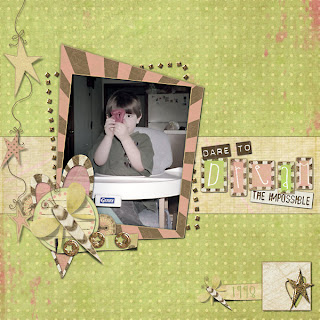
First thing I did was to filter the photo - I believe that I used Photoblast Color Wash Pro. But the idea was to tone down the bright colors in the photo to match the more muted colors in the LO. Then I cut the strip out of one of the background papers. Feed the star strip through the heart cutout by making two copies of the star element and putting the heart cutout inbetween. Then I erased the part I wanted on the top star element and added drop shadow to the bottom one.

Looking cool....

Looking cool...

This was such a fun template to play with. I cut the swirls out of one of the background papers. And the other things I did on this one was to lower the opacity on the "wish" button and put a dark blue stroke on the font to make the yellow pop a little better.

Thursday, July 3, 2008

In front of the Spamalot sign

In front of the Spamalot sign

To make this LO I did a fair amount of lowering the opacity or blending. First of all the star background paper had its opacity lowered and then I cut a piece of the darker background and lowered the opacity of the photo on top of it. I also lowered the opacity on the brown paper in the blue circle. I used the create warped text font tool to make the journaling inside the circle. Other than that I just arranged the elements after making the squares to frame everything on.

Playing Monopoly

Playing Monopoly

Okay... this one was pretty much putting the elements into place. I wanted to do a LO with the large flowers and the photo smaller. I'd seen some like it in galleries. I also lowered the opacity on the shadow flowers in the background and the leaves and the smaller ladybug in order to make the yellow and white flowers stand out more.